
Strive Academy

A little less daycare. A lot more personality.
Brand Strategy
Logo + Visual Identity
Website Design
Messaging + Positioning
Custom Illustration
Brand Guide
Marketing Strategy
When a Boise childcare center changed ownership, its new owners had a bigger vision for what it could become.
Formerly known as Kids Kampus, the newly imagined Strive Academy would put greater emphasis on early education, independence, healthy habits, and preparing children for kindergarten. The old name and identity weren't going to tell that story.
They needed a brand that felt as thoughtful as their approach to early childhood education. One that could capture the wonder of being a kid while speaking to the grown-ups making the decisions.

First, we did our homework.
Before we picked up a pencil, we needed to understand what the new owners were building and why it mattered. Through our Launchpad Intensive, we dug into their vision, values, audience, positioning, and long-term goals.
We explored what modern parents look for in an early learning environment, how Strive could communicate its educational philosophy, and what would make the academy feel different from a traditional daycare.
Because the goal wasn't simply to make Kids Kampus look better, it was to introduce something new.
For little people and their big people.
Here’s the interesting thing about branding a preschool: the people experiencing the brand aren’t necessarily the people choosing it.
Kids need something welcoming, playful, and full of possibility. Parents need to feel confident that their children are somewhere safe, nurturing, and genuinely invested in their development.
Playful without being precious.
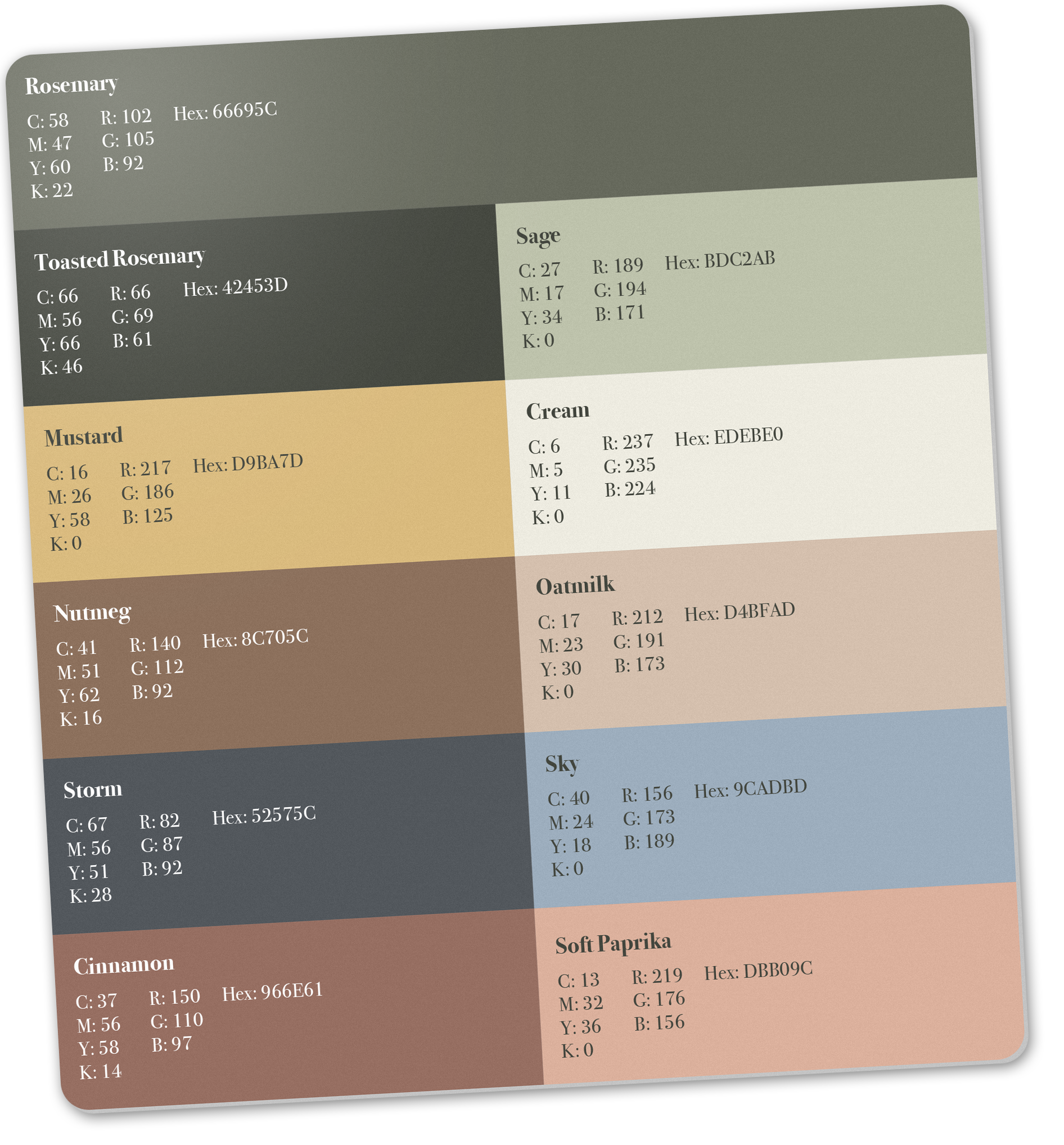
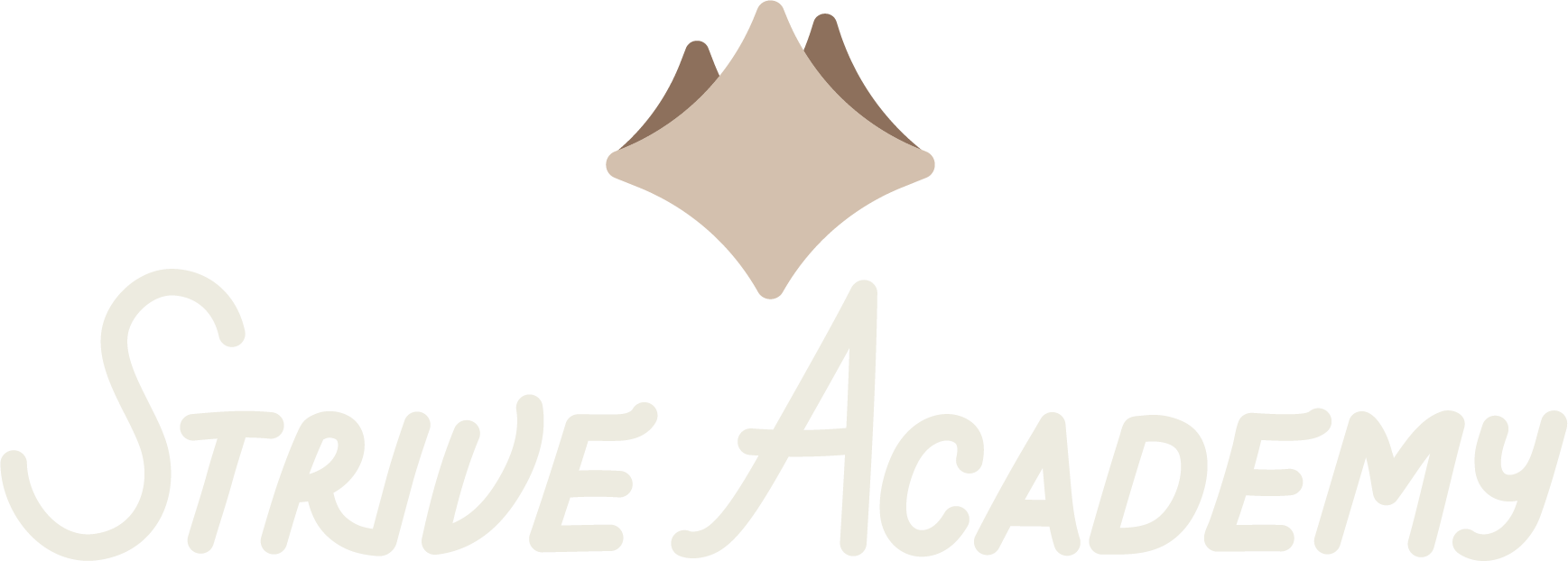
The nbew identity paired a friendly, hand-lettered logo with an earthy, sophisticated color palette and custom illustrations. Subtle references to the Boise foothills gave the brand a sense of place, while its reach-for-the-stars spirit captured the ambition behind Strive’s educational approach.
More than a pretty first impression.
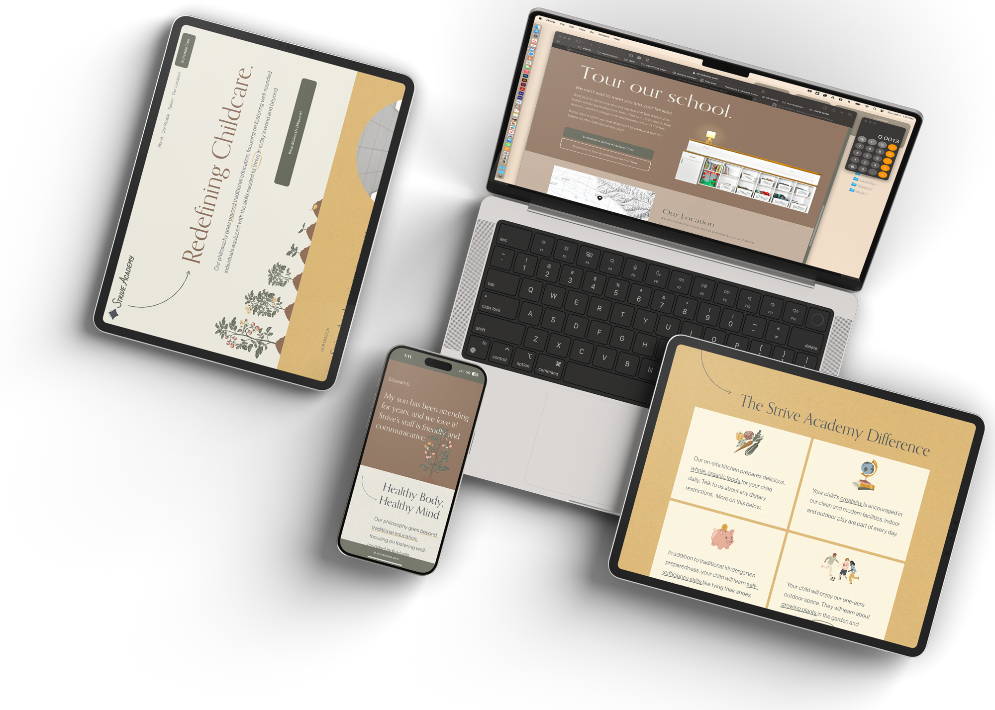
We carried Strive’s positioning, messaging, and visual identity into a redesigned website that could introduce the academy, communicate its philosophy, and help prospective families understand what made it worth considering.
We also created custom illustrative assets for use aross social media, print, and everyday communications, giving the team the flexibility to keep showing up consistently.

The good stuff.
A new name and identity for a new chapter, a website that speaks to parents without losing the magic of childhood, a collection of custom illustrations, practical brand tools, and a long-term marketing strategy to support the academy's growth.
All built around one pretty important idea:
Little people have big potential. Their brand should, too.